
« June 2013 | Main | October 2013 »
August 11, 2013
Optimizing the legacy Windows interface for touch and tablets
Tablet computers have been around for a quarter of a century, but it wasn't until the iPad's introduction that the tablet form factor took off. That's in part because the technology wasn't quite ready for tablets, and, in a much larger part, because Windows just didn't work well with tablets. Tablet historians will remember that both the first generation of tablets (circa 1992) and the second one (circa 2001) primarily used Wacom active digitizer pens. Those pens were (and are) precise enough to operate the Windows user interface, especially when aided by special Windows utilities and accommodations (Windows for Pen Computing back in 1992, and the Windows XP Tablet PC Edition in 2002).
Ever since the iPad came onto the scene, the market has been demanding touch instead of pens. Touch works great with operating environments designed for touch, such as iOS and Android, but not nearly as well with Windows. 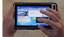 As of late, we've seen a number of new Windows tablets that use either resistive touch or even projected capacitive touch. Resistive works best with a stylus, though a firm finger touch usually also works, albeit not very precisely. Capacitive touch and legacy out-of-the-box Windows, however, are not a great match (except for the new Metro environment in Windows 8).
There's not much that can be done to remedy that situation. Many people want and need Windows on a tablet, but in order for it to work like Windows, it needs the full Windows user interface, and that is simply not designed for pen and touch. As a result, if you work on a tablet with a small screen and limited resolution, your screen may look like it does in the picture below:

The small scrollers, check boxes, menus and text work perfectly well if the tablet is used with a mouse, but they are almost impossible to use with touch.
Fortunately, there are ways to improve the situation, if only to some extent. And that is done through customization of the Windows interface. Here's how it's done.
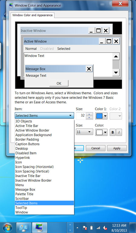
In Windows 7, go to Control Panels, then select Personalization. Go to the bottom of the screen and click on Window Color. At the bottom of that window, select Advanced Appearance Settings... What then shows up is the Window Color And Appearance tab that has been around for many years. It lets users adjust the size of numerous Windows interface items.
The "Item" pulldown provides access to:
3D Objects (lets you select the color)
Active Title Bar (select size and font)
Active Window Border (lets you select the color)
Application Background (lets you select the color)
Border Padding (select size)
Caption Buttons (lets you select the color)
Desktop (lets you select the color)
Disabled Item (lets you select the font color)
Hyperlink (lets you select the color)
Icon (select size and font)
Icon Spacing (Horizontal) (select spacing)
Item Spacing (Vertical) (select spacing)
Inactive Title Bar (select size, color and font)
Inactive Window Border (select size and color)
Menu (select size, color and font)
Message Box (select font, font size and color)
Palette Title (select size, font and font size)
Scrollbar (select size)
Selected Items (select size, color, font, font size and color)
ToolTip (select color, font, font size and color)
Window (select color)
Here's what it looks like:
The default values for all of those items are, surprise, what works best for a desktop computer with a mouse and a large screen. Problem is, those default desktop/mouse settings are also what virtually all Windows tablets come with. It's as if vendors thought Windows worked equally well on any size and type of platform, which it definitely does not.
As a result, Windows, which isn't very suitable for tablets in the first place, is even worse with the desktop/mouse default settings. So how are we going to remedy that situation? Not easily, but it can be optimized to work better on touch tablets.
Colors, obviously, don't make a difference. So let's forget about all the interface items where you can only change color. Icon size and spacing is also pretty much a matter of choice, as is font color, so let's drop those as well. That leaves:
Active Title Bar (select size and font)
Border Padding (select size)
Inactive Title Bar (select size, color and font)
Inactive Window Border (select size and color)
Menu (select size, color and font)
Message Box (select font, font size and color)
Palette Title (select size, font and font size)
Scrollbar (select size)
Selected Items (select size, color, font, font size and color)
ToolTip (select color, font, font size and color)
Inactive items also don't matter, and neither does stuff you don't actually interact with, so let's drop those. That leaves:
Active Title Bar (select size and font)
Border Padding (select size)
Menu (select size, color and font)
Palette Title (select size, font and font size)
Scrollbar (select size)
Selected Items (select size, color, font, font size and color)
Now we get to what matters. Here's why and how:
Active Title Bar -- contains the three all-important boxes that minimize a window, maximize it, or close it. Those are used all the time. They must be large enough to easily operate with touch or a stylus. (On a 7-inch 1024 x 600 pixel display, I set title bar size to 32 and font size to 11).
Border padding -- this one is annoyingly important. It's important because your finger or stylus must connect with the border to resize it. It's annoying because a border large enough to easily manipulate is an eye sore and takes up too much space, making Windows look clumsy.
Menu -- not really, really important, but you'd like to be able to see the menu choices, so make them large enough. I used 32 for size, and 11 for font size.
Palette Title -- honestly, I don't know why I left this one in there. I set it to 32 size and 11 font size.
Scrollbar -- perhaps the most important one of all. If you need to scroll up and down and left and right with your finger or a stylus, it MUST be large enough to easily touch. I made it 32, and the font 11.
Selected items -- that's the choices row when you select something from a menu. It needs to be large enough to read and select from via touch. Made it 32 and the text 11.
So there. Once you've done this, Windows won't be that terribly difficult to operate with your fingers or a stylus. It's not going to look very pretty, and you'll use up far too much valuable screen real estate with interface items designed for a mouse, and now resized to make them work as well as they possibly can with touch.
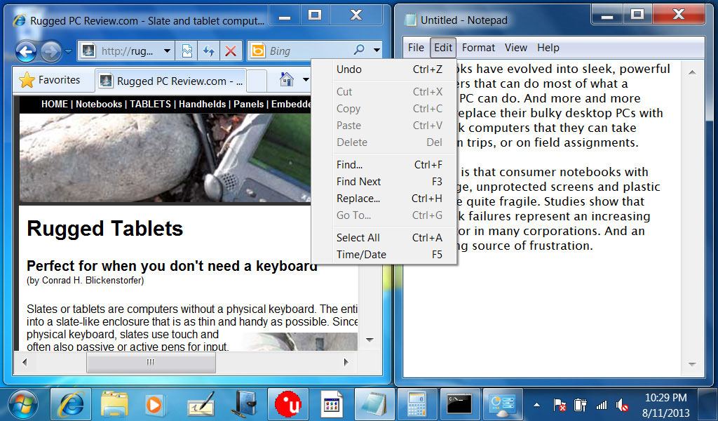
And here's what it looks like. Note the much larger scrollers, menus, window borders and text:
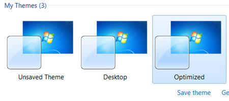
Another good thing to know is that you can save those settings as themes (see image below). Which means you can quickly toggle between a theme that's optimized for use with a mouse (or when the tablet is hooked up to a larger external screen), and when it is used as a tablet with finger touch.
Can that be done in Windows 8 as well? Not as easily. The "Advanced Appearance Settings" is gone from the Windows 8 (legacy) Control Panel. To change the interface, users can change text size in the Display control panel. But everything else can only be adjusted with the Registry Editor, which is not for the faint or heart (see how it's done).
Posted by conradb212 at 3:48 PM